



Le Creuset
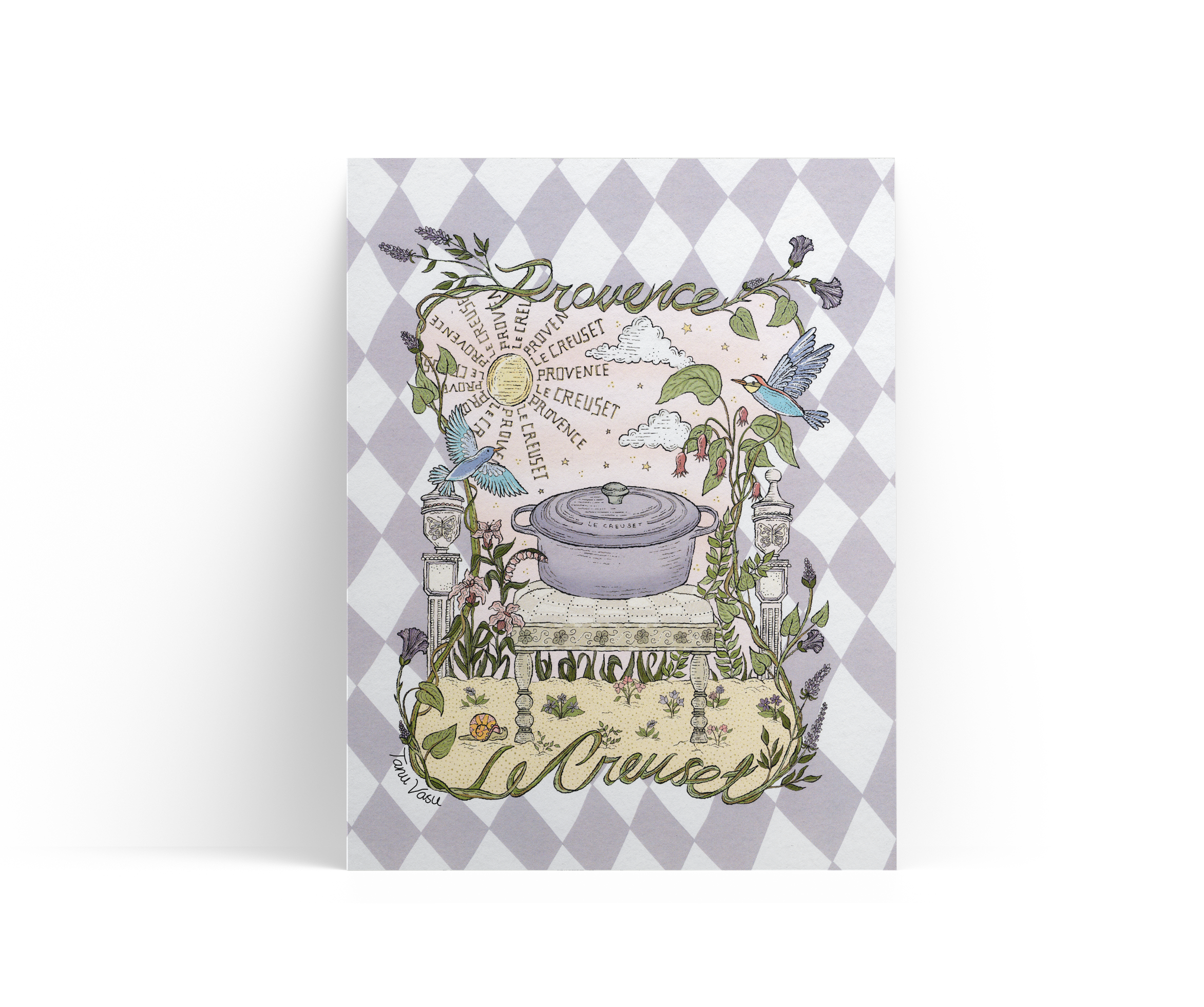
In collaboration with Le Creuset, this illustration was created to celebrate the return of their beloved "Provence" color. The piece began with deep research into the history and character of Provence — its sun-drenched lavender fields, the architecture and rhythms of the French countryside, and the region's distinctive birds, flora, and fauna — all in service of capturing the essence of Provence through a lens of storytelling and nostalgia.
Rendered as a whimsical garden scene, the artwork centers around Le Creuset's iconic cookware, set atop an antique provincial footstool like a small throne, surrounded by delicate botanicals, birds native to the region, and ornamental details that evoke the charm and tranquility of the Provençal landscape. Small flowers and trailing leaves weave throughout the composition, while the background features a checkerboard tiling pattern inspired by classic French countryside kitchens, rendered in the hue of Provence. Vines and grape leaves wrap around the Le Creuset name itself, hand-illustrated in tribute to the brand's founding in 1925 in Fresnoy-le-Grand, France.
Behind the Design
A closer look at the creative journey behind Le Creuset Card.
See what inspired the artwork as I share how Le Creuset’s beloved Provence color, the romance of the French countryside, and delicate botanical details came together to bring this story of place, craftsmanship, and nostalgia to life.